How to Choose White Offset Paper in 2026
Choosing White Offset Paper in 2026 is not just a question of finding the brightest sheet. The right grade must suit the press, ink, finish, budget, and job. A paper that looks crisp under showroom lights can appear dull beside a printed brand color. Small differences matter. Grammage affects handling and mailing weight; opacity can determine whether text from the reverse side shows through. Surface feel matters, too, especially for fine type and detailed images.
Market context helps, but it cannot choose the sheet for you. Smithers’ report The Future of Global Printing to 2028 estimated the global print market at $818.5 billion in 2022 and forecast growth to $846.4 billion by 2027. That forecast signals continuing demand for print, not a guarantee that every paper grade will perform alike. For objective comparisons, buyers can check grammage under ISO 536, brightness under ISO 2470-1, and opacity under ISO 2471. These measures make supplier specifications easier to compare. They do not replace a press test.
Before ordering a full run, request samples and confirm the paper’s thickness, shade, surface, and suitability for your printing process. Test the actual artwork and ink where possible. A white sheet may look neutral alone, then shift slightly beside a coated cover or under warm lighting. That detail is easy to miss. This guide explains how to evaluate White Offset Paper for print quality, consistency, and practical use in 2026—while keeping one point in view: specifications narrow the choice, but the printed result makes the final call.
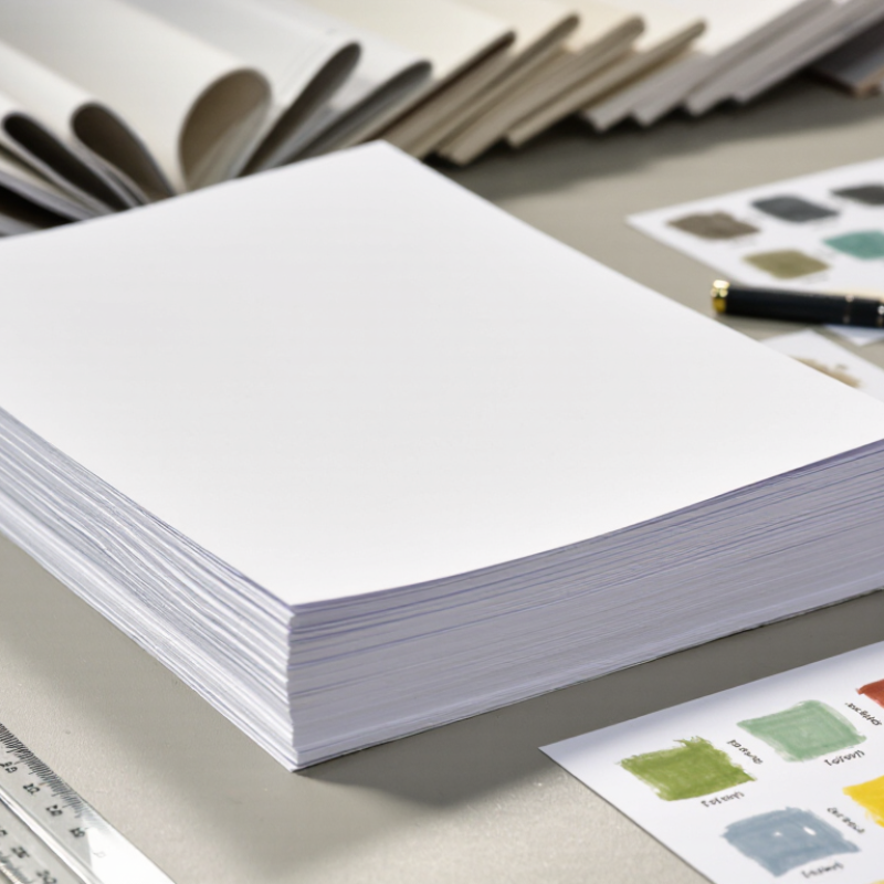
Identify the Printing Requirements for White Offset Paper
Before selecting white offset paper, define what the printed piece must do. A text-heavy booklet needs readable type and enough opacity to limit show-through. A bright brochure may benefit from a smoother surface and stronger color contrast. Start with the job. Note the finished size, page count, binding method, and whether readers will write on the paper.
Then match the sheet to the press and ink coverage. Confirm the recommended basis weight, grain direction, and moisture limits with the printer; paper that curls or feeds unevenly can slow production. Check both sides. Brightness affects perceived contrast, while whiteness can shift how colors appear. For dense images, request a printed proof on the intended stock, not just a screen preview. A specification sheet can look reassuring; a press test is less forgiving.
Also consider finishing and handling. Folding, scoring, coating, and mailing can expose weaknesses that a flat sample hides. Ask whether the chosen weight will fold cleanly and fit the binding without cracking or excess bulk. Compare samples under the lighting where the piece will be read. One detail is easy to overlook: the palest sheet is not always the best choice. It may make fine text feel harsh, or alter the mood of warm images. Make the decision against the actual artwork and production conditions, then record the approved grade and weight for reorders.
How to Choose White Offset Paper in 2026: Identify Your Printing Requirements
Paper weight is a starting point: lighter sheets suit forms and text pages, while heavier sheets add body for brochures and covers. Values shown are indicative selection points in grams per square metre (gsm), not fixed specifications. Check opacity, stiffness, print process, and finishing needs before selecting a grade.
Compare Paper Weight, Thickness, and Opacity
How to Choose White Offset Paper in 2026
Compare Paper Weight, Thickness, and Opacity
When choosing white offset paper, compare weight, thickness, and opacity separately. Weight, usually listed in grams per square metre (gsm), describes paper mass, not its exact feel. A heavier sheet may suit covers or inserts, while a lighter sheet can reduce bulk in a long booklet. Thickness, often measured in microns, affects stiffness and how the sheet handles during printing. Feel it first. Two papers with the same weight can still behave differently.
Tips: Ask for samples in the exact weight and finish you plan to order. Hold a page against printed text, then check how much shows through. Opacity matters for double-sided pages, especially when dark photos or dense paragraphs sit on the reverse. A bright white surface can make colours look crisp, but brightness alone does not guarantee opacity.
For a practical comparison, print the same small layout on each sample. Include fine text, a solid colour block, and an image with shadows. Check show-through under ordinary room lighting, not just on a bright desk. Also test folding and handling; a sheet that feels substantial may crack at a tight fold. Results can vary with ink coverage and press settings, so a paper sample is only part of the decision. I have found that choosing by gsm alone is tempting, but it can miss the detail that matters most in the finished piece.
Evaluate Whiteness, Brightness, and Surface Finish
When choosing white offset paper in 2026, compare whiteness, brightness, and surface finish separately. They describe different properties. ISO 2470-1 measures ISO brightness as blue-light reflectance near 457 nm; it does not measure perceived whiteness. ISO 11475:2017 evaluates CIE whiteness under D65 illumination and a 10-degree observer. Ask suppliers for test results, not just “bright white” descriptions. Those labels can hide meaningful differences.
A higher whiteness value may make cool colors look crisp, but it can also make warm-toned images feel harsh. Brightness affects how strongly the sheet reflects blue light. Surface finish changes ink holdout and fine-detail appearance. For finish data, ISO 8791-2 specifies the Bendtsen method for measuring paper roughness. A smooth sheet can support sharp small text; a slightly textured sheet may suit softer, less clinical visuals. Test the actual stock with your press settings. Paper samples under office lighting can mislead.
Tips: Compare sheets under consistent D65 lighting, then print the same color patch and fine text on each. Check both sides; surface feel and print response can differ. Record the measured whiteness, brightness, and roughness beside your proof. I would not choose by whiteness alone. It is an easy shortcut, and sometimes the wrong one.
Match Paper Grades to Printing Methods and End Uses
How to Choose White Offset Paper in 2026
Match the grade to the press and the job, not just the shade of white. For sheet-fed offset, a smooth, well-sized sheet helps hold fine text and halftone dots. For web offset, check runnability, moisture stability, and roll specifications; a paper that feeds poorly can waste time and sheets. Compare basis weight, opacity, brightness, and caliper using the same test conditions. A bright sheet may look crisp, but it can also increase glare under strong lighting. Not every “premium” grade earns its cost.
End use should guide the trade-off. Choose higher opacity for double-sided manuals, forms, or catalogues with dense images. For lightweight inserts, lower basis weight can reduce mailing weight, but check show-through on a printed sample. The American Forest & Paper Association’s 2022 paper recovery report estimated a 68% U.S. paper recycling rate. That figure supports asking about recycled content and recyclability, but it does not guarantee that every coated or mixed-material piece will be accepted locally. Test the finished item.
Tips: Request mill specifications and a press trial on the actual stock. Check ink drying, curl, and trimming after printing. Small differences matter. Keep one point in mind: paper choice is rarely perfect; a grade that suits the press may not suit every reader or finish.
Check Sustainability, Availability, and Supplier Quality
Choosing white offset paper in 2026 means looking beyond brightness and price. Sustainability claims deserve careful checking. Ask whether the paper contains recycled fiber, comes from responsibly managed sources, or has recognized environmental documentation. Verify what each claim covers; a recycled-content statement does not automatically describe the whole production process. Keep records.
Availability matters just as much. A paper may look ideal in a sample book but become difficult to reorder during a busy print run. Ask suppliers about current stock, typical lead times, minimum order quantities, and options if a grade is temporarily unavailable. Test the sheet on your actual press, too. Coating, thickness, and surface feel can affect ink absorption and finishing. A small trial can reveal problems before they become expensive.
Supplier quality shows in the details. Request a recent specification sheet and check basis weight, caliper, brightness, and tolerance ranges. Ask how damaged rolls or inconsistent batches are handled. Clear answers are useful; vague promises are not. In my experience, a dependable supplier communicates early when schedules shift. Still, no checklist removes every risk, and I have sometimes focused too much on paper specifications while overlooking delivery timing. Compare samples, confirm details in writing, and choose a grade your team can source consistently.