How to Create Eye Catching Beverage Labels for Your Brand?
Creating eye-catching beverage labels is an essential part of branding. A well-designed label grabs attention and communicates your product's essence. Beverage labels are often the first interaction a customer has with your brand, making them crucial.
Many brands overlook important details. Simple elements, such as color choices and font styles, dramatically impact consumer perception. An overly cluttered label can confuse potential buyers. Striking a balance is vital; clarity should always prevail.
Consider the story you want to tell. Unique illustrations or textures can set you apart. But remember, not every idea will resonate with your audience. It's essential to gather feedback and reflect on what works. Meaningful beverage labels should invite exploration, but avoid overwhelming the viewer. Adapting based on consumer response can lead to a more effective design.
Understanding the Importance of Beverage Labels in Brand Identity
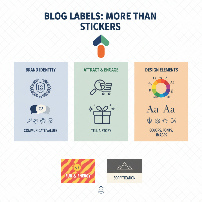
Beverage labels are more than just stickers. They communicate brand identity and values. A well-designed label can attract customers. It tells a story about the product inside. Colors, fonts, and images all play a role. For example, vibrant colors may suggest fun and energy. In contrast, muted tones can evoke sophistication.
Often, brands overlook the power of simplicity. Too much detail can confuse consumers. A crowded label might not get a second glance. It's essential to find the right balance. Consider using clear fonts and bold imagery. Also, labels should align with the brand message. This creates consistency across all products.
However, mistakes happen. A misprint can alter a label's meaning. Sometimes, designs don't resonate with the target audience. Feedback is crucial in these instances. Conducting testing can save future missteps. Remember, labels are a reflection of your brand. Keep refining until it truly captures your essence.
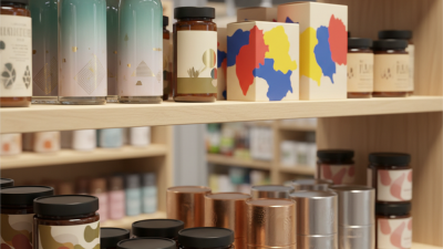
Key Elements of an Eye-Catching Beverage Label Design
Creating eye-catching beverage labels involves several key elements that can significantly impact your brand's appeal.
Color choice is paramount. Bright, bold hues can grab attention quickly. However, overusing colors might confuse customers. Ensure there's harmony.
Contrast is essential, too. Use darker shades against light backgrounds or vice versa. This enhances readability, making it easier for consumers to understand your message.
Typography plays a crucial role in label design. Select fonts that align with your brand's personality. A playful font can suggest fun, while a sleek font may convey sophistication.
But be cautious! Overly complex fonts can detract from clarity. Keep essential information prominent.
Visual elements like images or graphics can also enhance your design. They should be relevant to your beverage. Yet, cluttering the label with too many visuals can be overwhelming.
Balance is key.
Finally, don't forget about the label shape and size. Unique shapes can stand out, but they should fit the bottle well.
An irregular shape might look interesting but can complicate storage. Test your designs with potential customers. Gather feedback. Reflect on what works and what doesn’t.
Iteration is vital in achieving an effective beverage label that truly captivates.
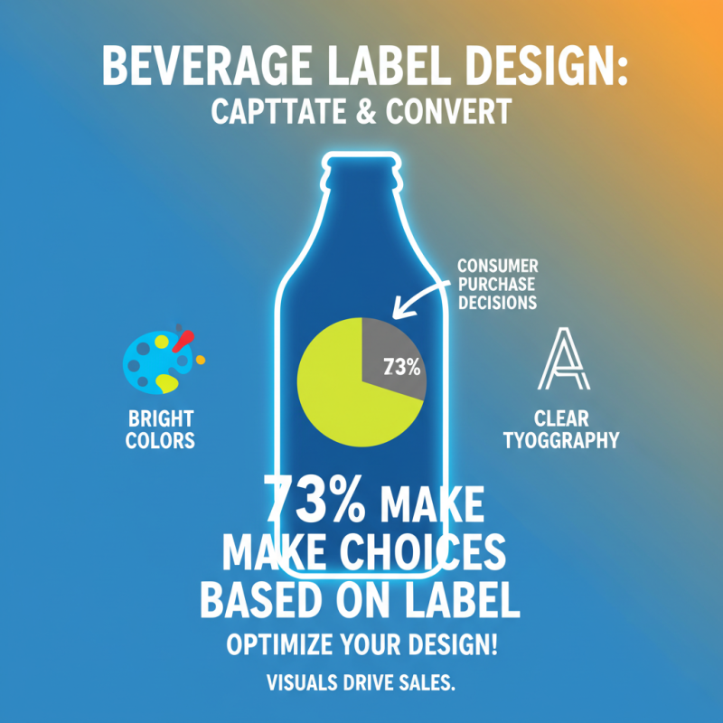
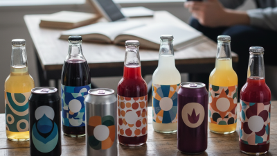
Utilizing Color Psychology to Enhance Beverage Label Appeal
Color psychology plays a vital role in beverage label design. Various studies indicate that colors can evoke emotions and influence consumer decisions. In fact, about 85% of shoppers base their purchase decisions primarily on color. This means your beverage label needs to stand out in a crowded marketplace.
When designing labels, consider the nature of your beverage. For instance, red can stimulate appetite and increase energy, making it ideal for soft drinks. Blue often conveys trust and reliability, which works well for water brands. However, using too many colors can lead to confusion. Brands must find the right balance to communicate their message effectively.
Remember that every consumer is unique. What attracts one person might not appeal to another. This is where market research can help. Seek feedback on color choices from potential customers, but don’t get disheartened by negative responses. Use these insights to refine your design. A/B testing different labels can be beneficial. It’s a learning process that requires patience and adjustments. Your label should reflect the essence of your brand and resonate with your audience while also standing out on the shelf.
How to Create Eye Catching Beverage Labels for Your Brand?
| Color |
Psychological Impact |
Suitable Beverage Types |
| Red |
Stimulates appetite and creates urgency. |
Energy drinks, sodas |
| Blue |
Promotes calmness and trust. |
Water, herbal teas |
| Green |
Signifies health and wellness. |
Juices, health drinks |
| Yellow |
Associates with happiness and energy. |
Citrus beverages, lemonades |
| Purple |
Conveys luxury and creativity. |
Premium wines, berry drinks |
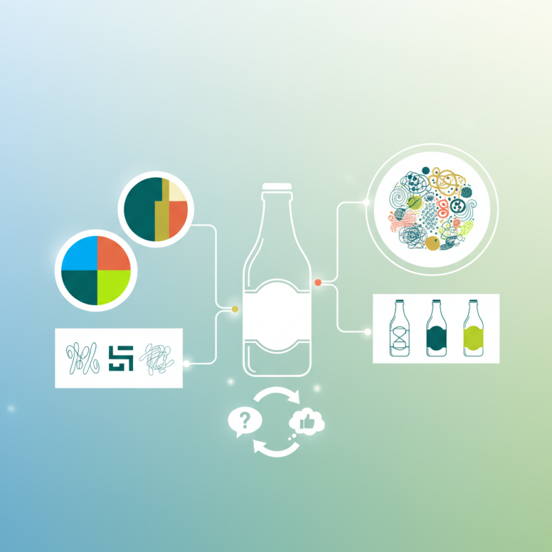
Incorporating Regulatory Compliance in Beverage Labeling
Creating beverage labels that catch the eye is crucial for any brand. However, it’s equally important to ensure these labels comply with regulations. Most beverage categories have specific labeling laws. These can vary by region, so it’s vital to research the requirements that pertain to your product.
For example, nutritional information is often a must. This includes calorie count, serving size, and ingredient lists. Failing to include these can result in hefty fines or even product recalls. The label must also display any allergens. Missing this detail may not only disappoint customers but lead to serious health risks.
Visual appeal is key, but compliance shouldn’t be an afterthought. Consider using contrasting colors to highlight mandatory information. However, don’t let compliance overshadow creativity. Finding the right balance can be challenging. Experimenting with different layouts can help. Test how your label looks under various lighting conditions. Sometimes what appears appealing in one light, may seem dull in another. Always keep refining your approach, as regulations and consumer preferences evolve constantly.
Visualizing Beverage Label Compliance Requirements