Top Tips for Designing Effective Printing Banners for Your Business Needs
When it comes to promoting your business, the visual elements play a crucial role in catching the attention of potential customers. One of the most effective tools in outdoor and indoor marketing strategies is a well-designed printing banner. These banners can convey messages, announce events, or simply enhance brand visibility, making them an essential component of any promotional campaign. However, to achieve the desired impact, it is vital to consider key factors that influence their effectiveness.
In this guide, we will explore top tips for designing printing banners that not only stand out but also convey your intended message clearly and efficiently. From choosing the right colors and fonts to ensuring the layout is both eye-catching and informative, each design element contributes to the overall success of your banner. By understanding your audience and tailoring your design accordingly, you can create banners that not only draw attention but also leave a lasting impression. Whether you are promoting a special sale, a grand opening, or simply raising awareness about your brand, a thoughtfully crafted printing banner can be a game changer in your business marketing efforts.
Understanding the Purpose of Your Printing Banner
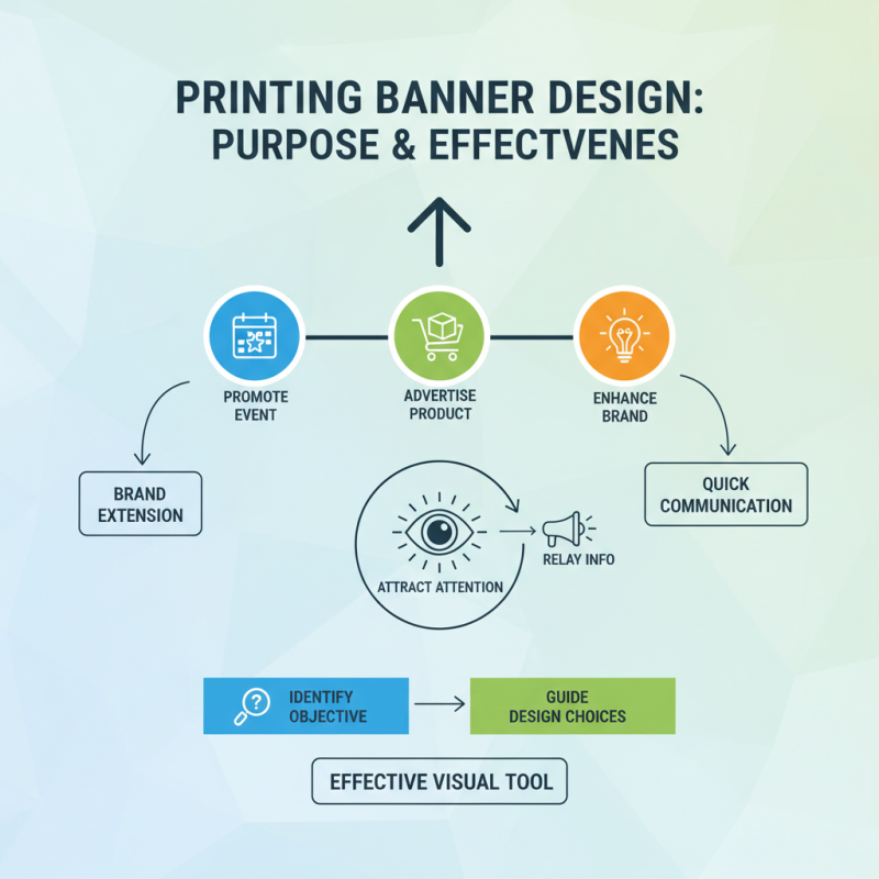
When designing a printing banner, understanding its purpose is crucial to creating an effective visual communication tool. A banner serves as an extension of your brand, aiming to attract attention and relay essential information quickly. Begin by identifying the primary objective of your banner: Are you promoting a special event, advertising a product, or enhancing brand awareness? Clear objectives will guide your design choices, ensuring that every element of the banner contributes to its overall effectiveness.
Moreover, consider the audience that the banner is intended for. Knowing your target demographic helps in choosing the right message and imagery that resonates with them. Use language that speaks directly to their needs and preferences. The design should also reflect the tone of your business, whether it's professional, playful, or innovative. By aligning the banner’s purpose with your audience’s interests, you create a compelling visual that not only captures attention but also leaves a lasting impression.
Choosing the Right Size and Material for Your Banners
When designing printing banners for your business, selecting the right size and material is crucial for maximizing impact. The size of your banner should be determined by where it will be displayed and the distance from which it will be viewed. For a high-visibility location, such as a trade show or outdoor event, larger banners can capture attention from afar. Conversely, smaller banners are ideal for close-up engagements, like storefronts or in-store promotions. Always consider the aspect ratio, ensuring that your design elements remain balanced and visually appealing.
In addition to size, the choice of material significantly influences your banner's effectiveness. Vinyl is a popular choice for outdoor banners due to its durability and weather resistance, while fabric materials can provide a more sophisticated look for indoor displays. Think about the banner's lifespan—if it’s a temporary event, lighter materials may suffice, but for long-term promotions, investing in sturdier materials may save you money in the long run.
**Tips:** Always test the readability of your text from various distances, and ensure colors contrast well against the background. Additionally, consider using double-sided banners for maximum exposure in high-traffic areas. Tailoring both size and material to your specific needs will enhance visibility and help convey your message effectively.
Top Tips for Designing Effective Printing Banners for Your Business Needs - Choosing the Right Size and Material for Your Banners
| Aspect |
Recommendation |
Benefits |
| Size |
Choose between 2x6 ft or 3x8 ft for higher visibility |
Increased visibility from a distance |
| Material |
Vinyl for outdoor banners; Fabric for indoor |
Durability and a professional look |
| Design |
Use bold colors and simple fonts |
Easier readability and attention grabbing |
| Graphics |
High-resolution images |
Professional appearance and enhanced quality |
| Placement |
Position at eye level and avoid cluttered areas |
Maximized exposure and effectiveness |
Essential Design Elements for Eye-Catching Banners
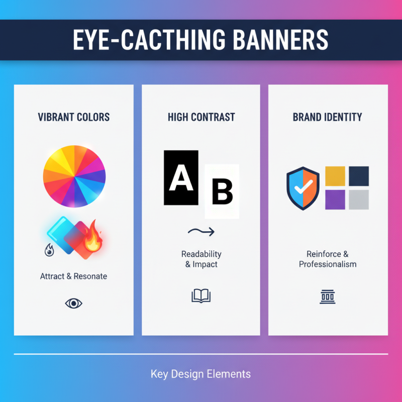
Creating eye-catching banners requires careful consideration of several essential design elements. First and foremost, vibrant colors play a pivotal role in attracting attention. When choosing a color palette, it's crucial to select shades that not only captivate but also resonate with the target audience. High contrast between text and background colors enhances readability, ensuring that your message stands out even from a distance. Additionally, incorporating brand colors can reinforce brand identity while maintaining a professional appearance.
Another critical element is the use of clear and engaging typography. Selecting fonts that are easy to read at various distances is essential; bold and sans-serif fonts are often the best choices for banners. Limiting the number of different fonts to two or three ensures a cohesive look and avoids visual clutter. Moreover, strategic positioning of key information, such as headlines and calls to action, can guide the viewer's eye and communicate the intended message effectively. Including relevant images or graphics can also enhance appeal, provided they complement the overall design without overwhelming the core information.
Lastly, consider the overall layout and spacing. Adequate white space can make a significant difference in the perception of your banner, as it helps separate different elements and improves clarity. An organized layout helps viewers absorb the information quickly, ensuring that the most important elements catch their eye first. Balancing these design aspects will result in a professional and engaging banner that effectively serves your business needs.
Incorporating Branding Elements into Your Banner Design
When designing printing banners for your business, incorporating branding elements is crucial for effective communication. A recent study by the Journal of Marketing found that consistent brand presentation across all platforms increases revenue by up to 23%. This highlights the importance of utilizing your brand’s colors, fonts, and logos on your banners to create a cohesive visual identity that resonates with your target audience.
One key tip for effective banner design is to prioritize simplicity while integrating branding elements. Your banner should not be overcrowded with information; instead, focus on a clear message that aligns with your brand identity. Use bold typography for your business name and maintain a color palette consistent with your brand to ensure that your banner stands out, yet remains identifiable. Additionally, the Manchester Business School found that color consistency can increase brand recognition by 80%, making it vital to use your brand colors effectively in your designs.
Moreover, imagery plays a significant role. Using high-quality images that reflect your brand ethos can enhance visual appeal and engage potential customers. Ensure that any images are not only relevant to your message but also reflect your branding style. A well-crafted banner featuring deliberate branding elements can significantly attract attention, as studies show that visuals are processed 60,000 times faster than text, making it imperative to create a striking first impression.
Tips for Ensuring Readability and Visual Impact
When designing banners for your business needs, ensuring readability and visual impact is essential. A clear, focused message will quickly grab the attention of passersby. Use concise language, and ensure that the text is large enough to be read from a distance. This can be achieved by using bold fonts and limiting the amount of text on the banner. Aim for a clear hierarchy in your text—headlines should be prominent, followed by supporting information in smaller sizes.
Colors play a crucial role in making your banner stand out while maintaining readability. Choose a color palette that contrasts well with your text; for example, a dark font on a light background or vice versa. Spread the colors wisely to create a balanced look, but avoid overwhelming the viewer with too many hues. Incorporating white space can also enhance readability, making the banner less cluttered and easier to digest.
Lastly, images and graphics can enhance the visual impact of your banner. Ensure that any visuals complement your message and do not distract from the text. High-resolution images will make your banner look professional and engaging. Consider a call to action that encourages viewers to engage further with your business. By merging clear typography, thoughtful color choices, and complementary visuals, you can create effective printing banners that communicate your business needs effectively.
Printing Banners Effectiveness