How to Make Labels That Stand Out for Your Business?
In today's competitive market, it is essential to make labels that truly stand out. Effective labels communicate your brand's story. They should capture attention and convey important information. A unique design can differentiate your products from others on the shelf.
To make labels that resonate with customers, consider the colors, fonts, and materials you choose. Vibrant colors can evoke emotions, while clean fonts enhance readability. The texture of the label also matters. A glossy finish may attract more eyes compared to a matte look.
It's easy to overlook the importance of labels. They are not just functional; they are part of your brand identity. Think about the potential impact of a well-crafted label. Reflect on what makes yours unique. Continuously strive to enhance your label designs for better engagement.
Understanding the Importance of Labels in Branding and Marketing
Labels play a crucial role in shaping brand identity. They are often the first point of interaction between a product and a potential customer. A well-designed label communicates vital information. It conveys brand values, product benefits, and quality. Clarity is essential. If labels are cluttered or confusing, consumers may walk away.
Colors, fonts, and images matter greatly. Bold colors can catch attention, while clear fonts enhance readability. Imagery should resonate with the target audience. However, many businesses overlook this aspect. They may stick to traditional designs, missing opportunities for uniqueness. Regularly reassessing label designs can yield surprising insights.
Feedback from consumers can reveal whether labels truly represent the brand. Conducting focus groups might help. Test new designs and gauge reactions. This process brings imperfections to light. Labels should evolve alongside consumer trends. Ignoring this can lead to stagnation. A label is more than just decoration; it embodies the essence of your brand.
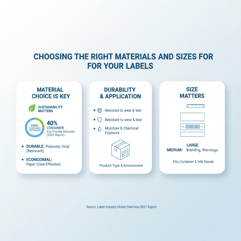
Choosing the Right Materials and Sizes for Your Labels
When creating labels for your business, material choice is key. Durable materials like polyester or vinyl resist wear and tear, while paper is often more economical. A 2021 report from the Label Industry Global Overview indicated that nearly 40% of consumers prefer labels made from environmentally friendly materials. This trend underscores the importance of sustainability in label production.
Label size significantly impacts visibility. Research shows that larger labels attract over 30% more attention in retail environments. A balance must be struck; too large can overwhelm, while too small may go unnoticed. Identifying your target market informs the ideal label size and design. It's essential to test different sizes under real-world conditions to gauge effectiveness.
Sometimes, the chosen materials may not perform as expected. For instance, colors might fade or adhesive might fail under certain conditions. Regularly reviewing label performance across different environments keeps your branding consistent. Iterate and adapt based on feedback and market trends for lasting success.
Design Principles for Eye-Catching and Effective Labels
Creating labels that stand out involves a deep understanding of design principles. Research indicates that 70% of consumers base their purchase decisions on label design alone. Effective labels convey clear information while attracting attention. Bright colors, unique shapes, and engaging typography can significantly enhance visibility.
Tip: Use contrasting colors to increase readability. Studies show that labels with high contrast can improve legibility by up to 60%. Ensure your font choice complements your brand identity yet remains easy to read.
Adding visuals, like images or icons, can also make a label more appealing. A survey found that products with visual elements see a 30% increase in sales. However, balance is crucial. Overloading a label with clutter can confuse consumers and dilute the brand message. Simplifying can lead to stronger impressions.
Tip: Consider using negative space strategically. Labels that strategically leave areas blank can capture attention more effectively than those that are overly busy. Aim for a clean design that reflects professionalism and clarity while inviting consumers to connect with your product.
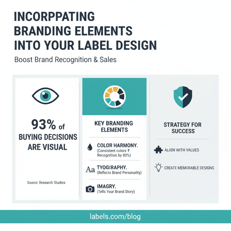
Incorporating Branding Elements into Your Label Design
Creating labels that resonate with customers involves blending branding elements strategically. Research shows that visuals account for 93% of consumer purchasing decisions. This highlights the need for designs that align with brand values. Common elements like color, typography, and imagery play crucial roles. For instance, brands that use consistent colors can increase brand recognition by up to 80%.
Incorporating branding into label design is more than aesthetics. It’s about creating a narrative. A unique label can communicate your story. Statistics reveal that 52% of consumers are more likely to buy from brands that resonate with them emotionally. This emotional connection is often forged through thoughtful design. Using specific colors can evoke feelings—blue often represents trust, while red can convey urgency. However, overcomplicating a label can confuse customers.
Iterative design processes can refine label effectiveness. Testing different versions can yield surprising insights. Some designs that seem appealing might not always resonate as expected. A study found that 65% of consumers prefer simplicity in packaging. Labels should capture attention, but they should also communicate clearly. Every design choice needs reflection to ensure a balance between beauty and clarity.
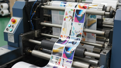
Tips for Printing and Producing High-Quality Labels
Creating high-quality labels is vital for any business. They convey your brand identity and attract customers. Start by selecting the right materials.
Durable options like vinyl or polyester ensure longevity. Consider the environment if you want your labels to be eco-friendly. A thoughtful choice shows responsibility and boosts brand image.
Next, focus on design elements. Use bold colors and clear typography to enhance visibility. Play with shapes to create unique silhouettes. However, don’t go overboard. Cluttered designs can confuse potential customers. Balance is essential. Test various designs before the final print. This process can reveal unexpected issues.
Printing quality matters immensely. Use a reputable printer that offers high-resolution output. Inconsistencies can harm your professional image. Always request samples to check colors and finishes. Reflect on past mistakes; they can inform better choices. Even small details like adhesive strength or finish can influence performance. Consider revisiting your label strategy regularly.